5 Suggestions for Newzik
I've been having an opportunity to do more of a deep dive into Newzik, the sheet music reading app that I've done a few videos on, and now that I'm using it as a daily app just to see what it's like, I'm really finding myself enjoying this. Especially as I've said before, my favorite thing is being able to mark the music and turn pages hands-free with my AirTurn without interruption. That is a game changer for me. That one feature makes this app so worthwhile, just in terms of my productivity and the speed at which I can write notes in rehearsal. But I do have a couple of things that I'm noticing that I wish the developers could improve on, and so I thought it'd be fun to make this quick video of five things that I would like to see as improvements for Newzik.
Removing Songs from Setlists
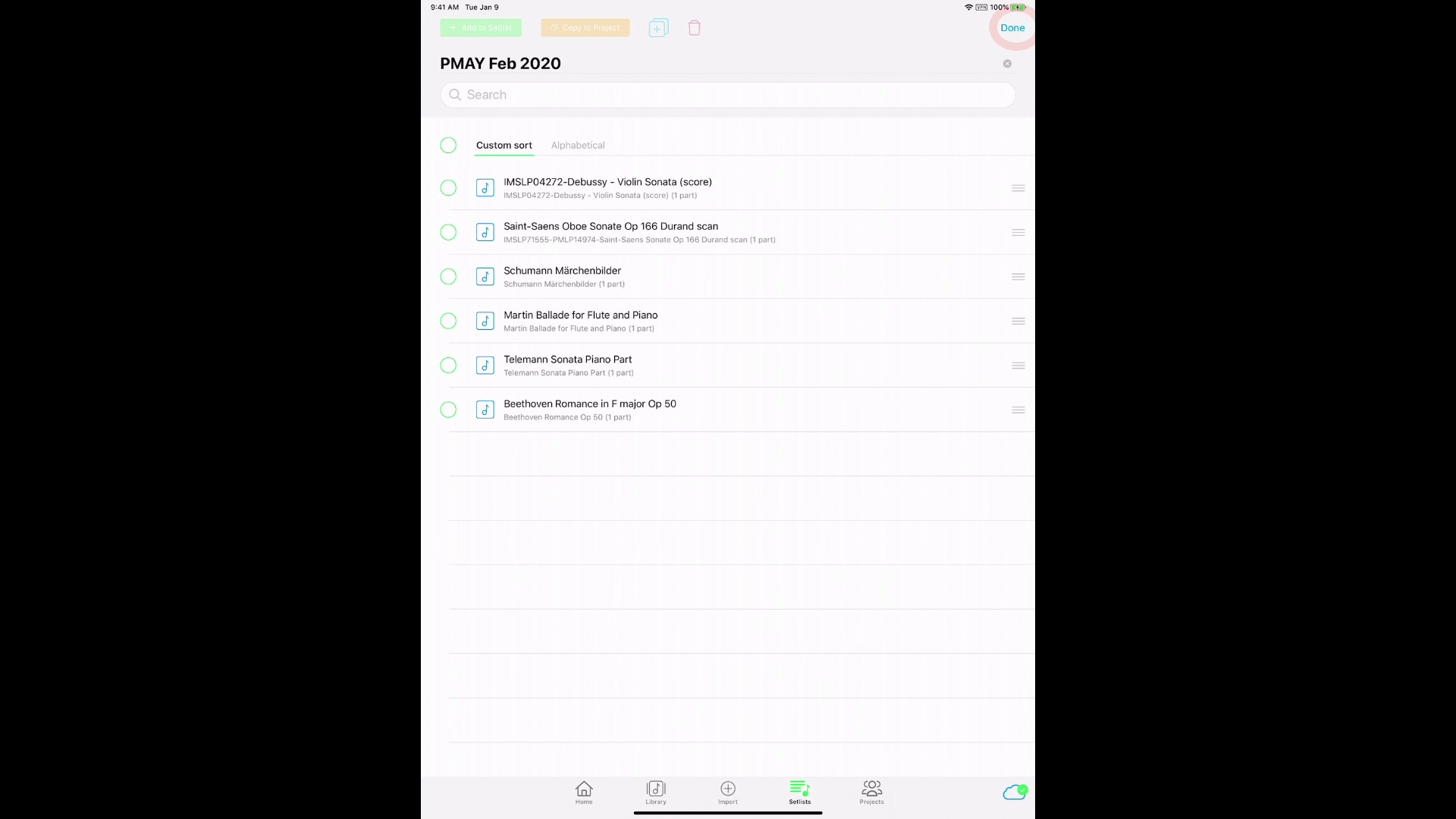
First off, I use Setlists a lot. Setlists are collections of pieces that you can assemble for programs and performances. As soon as you finish turning the pages of one piece, Newzik will automatically open the next piece, as if all the pieces in your setlist were combined in one single book.
If you need to change the order, I can tap the edit button and I can use the hamburger menus on the right to move things around.
Let's say I want to get rid of a piece in my setlist. To do so, I can tap the trash can. But wait - here's what scares me. It can either remove from Setlist or Delete Permanently.
Removing from the Setlist is fine, but deleting permanently out of my whole library? I'm always nervous about any kind of delete option. I think this is a bad idea. I would just stick with one option to remove from Setlist. The other option I would say would be to be able to “replace” with a different piece, but to delete permanently, that’s just a very bad idea. The way the popup menu is set up, it just takes one little tap and you've lost that piece from your library- too dangerous! In my opinion, deletion should only happen at the base library level.
2. Setlist Navigation
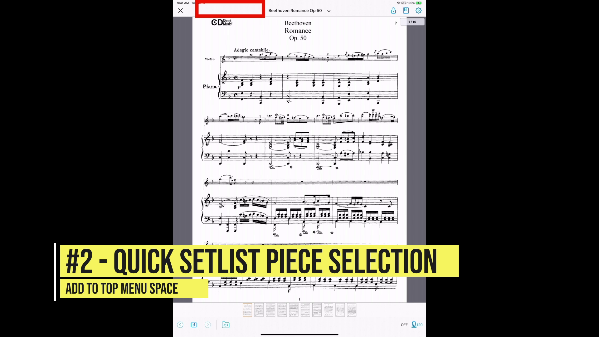
My second suggestion happens to be with the menu options in the Setlist view. When you're in a piece and you tap the middle of the screen, these menu options appear at the top and the bottom.
Newzik is really optimized for ensembles and conductors and members of an orchestra or a band. So when you tap this top title area, you can see other parts that are embedded within this piece. For this one, I only have the piano part.
But if I need to jump to a different piece in my Setlist, here's what I have to do. First, I have to tap on the corner X, to close the page view,
then I have to select the piece within the setlist view.
I think that's a little clumsy, with too many steps for me. What I'd like to be able to do is tap the middle of the screen and then have an option appear on the top menu area, either to the left or right (I would suggest to the left) where I can quickly access all of the items, then have it as a drop down menu to see all the other pieces on my Setlist. A streamlined Setlists selection option as part of the top menu bar would make life much easier for heavy setlist users like me.
3. Add Search Icon Everywhere
Here's my third suggestion: within any piece, whether it's in the Setlist or just a piece by itself, I think along the top right menu area there's one more icon we really need, and that's the search icon. That search should applicable for any piece in your library. Right now, the top menu area has 3 main icons - a lock icon (not sure what that does yet), a bookmark icon, and then the settings icon. There’s plenty of space for a search icon, and when you’re an accompanist like me, you’re dealing with dozens and dozens of pieces. If I ever have to accompany an audition, I have to be able to access my whole library and if it's not in my Setlist, I need to be able to find it quickly. Right now, Newzik forces me to close the sheet music view, tap on Library, and then perform the search function. That's way too many steps for me to quickly find my piece. I want to be able to search my entire library from anywhere in the app. Personally, I think the search bar should be right on the top menu area towards the right side next to the other icons.
4. Add Bookmark Graphics
My fourth suggestion has to do with the bookmarks. When I tap the middle of the screen, I can see a row of pages making up the sheet music file on the bottom. One thing that I thought might be kind of cool would be if I could see which of those pages have bookmarks.
For example, in this piece, I have three bookmarks on page six, page nine, and page 12. I can only see those bookmarks if I open the bookmark menu. it'd be nice if somewhere on the bottom we could maybe see a color bar or something beneath the pages to show me where my bookmarks are. It would also make the bookmark view more efficient, so that you could see a basic view with one tap, instead of requiring two taps with the current bookmark menu. Also, there’s no way to see which pages already have bookmarks outside of the bookmark menu - this makes it too easy to accidentally have multiple bookmarks on the same page, if that isn’t intended.
5. Custom Half-Page Turns
One last thing suggestion is for a specialized kind of half page turn. Every once in a while in a piece of music, you come across something really annoying with a layout. For example, I've got this piece over here with a big, fast run up to the end of the last measure, and then I've got to turn the page to see the resolving chord. This is an ideal spot for a half page turn, where I can turn half a page ahead of time.
To turn on half page turns in Newzik, so go into settings, then select “page turn”
Then turn on “half page turn”.
You can adjust the half page turn split point on each page.
Half page turn view
The problem is, now every single page will be viewed with half page turns. What if I don't need this feature for every single page? One fantastic option would be to apply half page turns only for specific pages. No one else I know is doing this - half or whole page turns are global view settings, meaning they’re applied for every single page one way or the other. To be able to mix up page turn types in a given piece would be fantastic!
So those are a few of my suggestions for Newzik. I have to say, this is a great app, and I'm really enjoying this. Some of the things I'm highlighting right now are things that I see in other apps like the search bar and the Setlist selection options. There's a lot of empty space in Newzik’s top menu bar, and while it looks clean and nice, I think they’re missing an opportunity to make it more efficient for a musician. So at very least, a search bar for any piece and a Setlist organization on the top bar, that would be really helpful. And the other things are just wishlist items that would help Newzik to stand out above the crowd in terms of functionality.
If you have any other suggestions and ideas for the Newzik team, please put them in the comments below! The Newzik folks have been so friendly and so responsive to my suggestions. Let's see if we can challenge them in some of these new ideas and help them have an opportunity to make this the very best sheet music reader for everybody!


