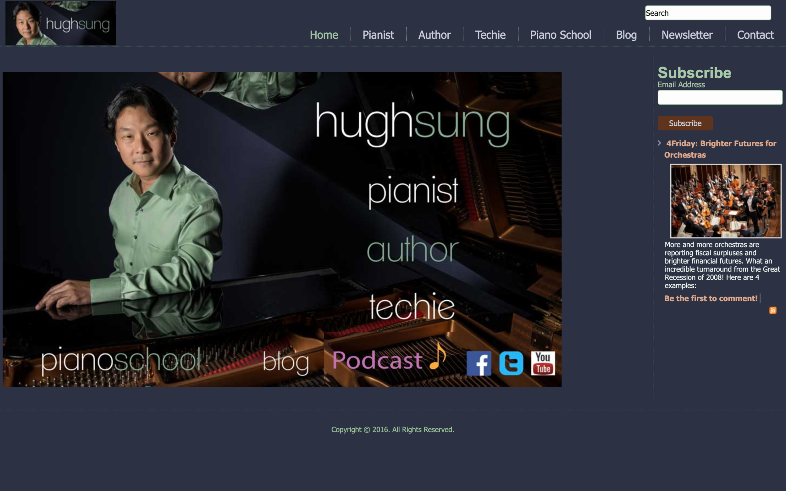
R.I.P.
2014-2020 website design
Well, it’s about time!
My last website design lasted for nearly 6 years. Back in 2014, responsive websites were the hot issue - with the rise of mobile screens and tablets predicted to overshadow desktop and laptop computer browsers, Google was putting a heavy emphasis on websites that could adapt their designs to accommodate smaller screens legibly. To that end, and with a desire to try to maintain a unique “artsy” design, I created a landing page based off of a brand new publicity photo shot by the brand new online school I had just joined, ArtistWorks. I sliced the image into blocks so that all of the text could be shuffled accordingly on smaller screens as clickable links. At the time, I thought it looked pretty cool, and it highlighted the main areas of my life as a pianist, author of a book on digital sheet music, passion for technology, my online popular piano school at ArtistWorks, and my podcast show, A Musical Life. Needless to say, it was a pretty big improvement from my previous website design, which had been around for probably close to 10 years:
“Music Meets Tech” was the running tagline, exploring all my crazy experiments with tech toys and software, trying out the latest gizmos and web services to enhance my life as a professional pianist. Wow, I’m getting a headache just looking at that mountain of links along the left column! What a 90’s design! This website design launched on Feb 11 - I think the year was 2006 - I remember it being the result of a snowed in Sunday, when I couldn’t get to church, and had a whole day of nothing to do. So why not build a website?
Of course, that was a HUGE improvement over THIS:
My very first website. Nothing more than a bare bulletin board to advertise an upcoming joint recital with flutist Jeffrey Khaner. We both had so much more hair back then…sigh…
I had been meaning to update my personal website for a long time, but life got in the way with an incredibly busy schedule. To be honest, another reason was a hesitation to commit to yet another content producing resource. An interesting confluence of factors pushed me to finally revamp my site - one work-related, the other, an “aha” moment looking back at a sudden burst of creative energy with my new travel and food videos and realizing that rather than try to create diverse streams of content (writing, podcasting, vlogging, etc.), I could perhaps focus on my favorite medium - video - and craft an entire site around that as the primary content builder.
And so, this new iteration was born.
My first website was hand coded barebones HTML. The second was on an open source CMS (content management system), the name of which completely escapes me at the moment. The last one was built with Joomla.
I had heard amazing things about WordPress, so I spent several years working in that platform on other external sites, with an eye to one day converting my own site to WP. While WordPress is definitely powerful and flexible, it is also extremely high maintenance and a little on the kludgy side.
Several friends of mine had been recommending SquareSpace as a great all-in-one platform. I initially hesitated because I like to have as many tools in my toolbox for making things. But as my life has become more complex and time is more of a precious commodity, I began to realize that SquareSpace’s simplicity was a much better solution that would allow me to focus on content and not waste time over infrastructure. Case in point: my previous website took about a month to put together. This one? About 3 days, with the majority of it done within only 1. The other 2 days were design tweaks and getting more familiar with SquareSpace’s streamlined interface and feature set.
So, R.I.P. website - and helllooooo, SquareSpace! I’ll probably be posting some more back end tutorials on building SquareSpace sites in the future. I’m very, very impressed so far, and - well, I dunno, I think it looks pretty slick! What do you think?


